
We’re in the midst of a tech revolution, and with that comes a whole host of new ecommerce trends to consider. Are you looking to bring your products to life with 360 views? Perhaps you fancy using Augmented Reality so customers can try before they buy? Or maybe you want to slow their scroll with TikTok shop.
It might not even be media enhancements you’re looking for, and instead, maybe you’re thinking about introducing product subscriptions, bundles or personalising recommendations. Whatever you decide, one trend suitable for every site modification is called ‘Growth Design’.
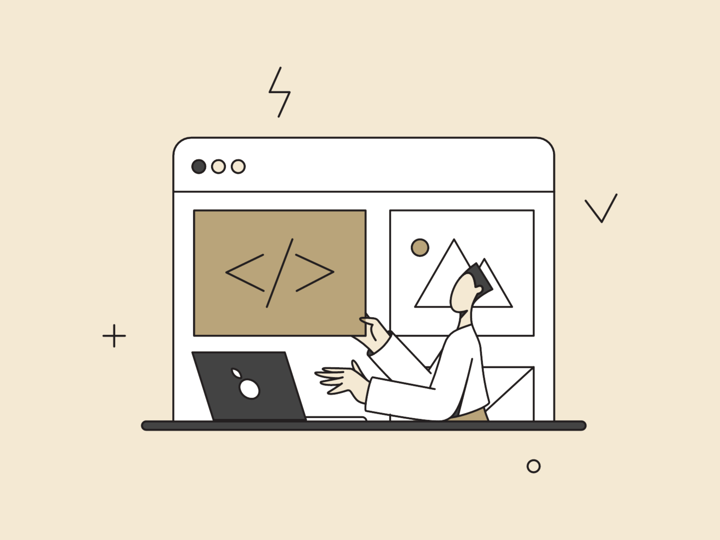
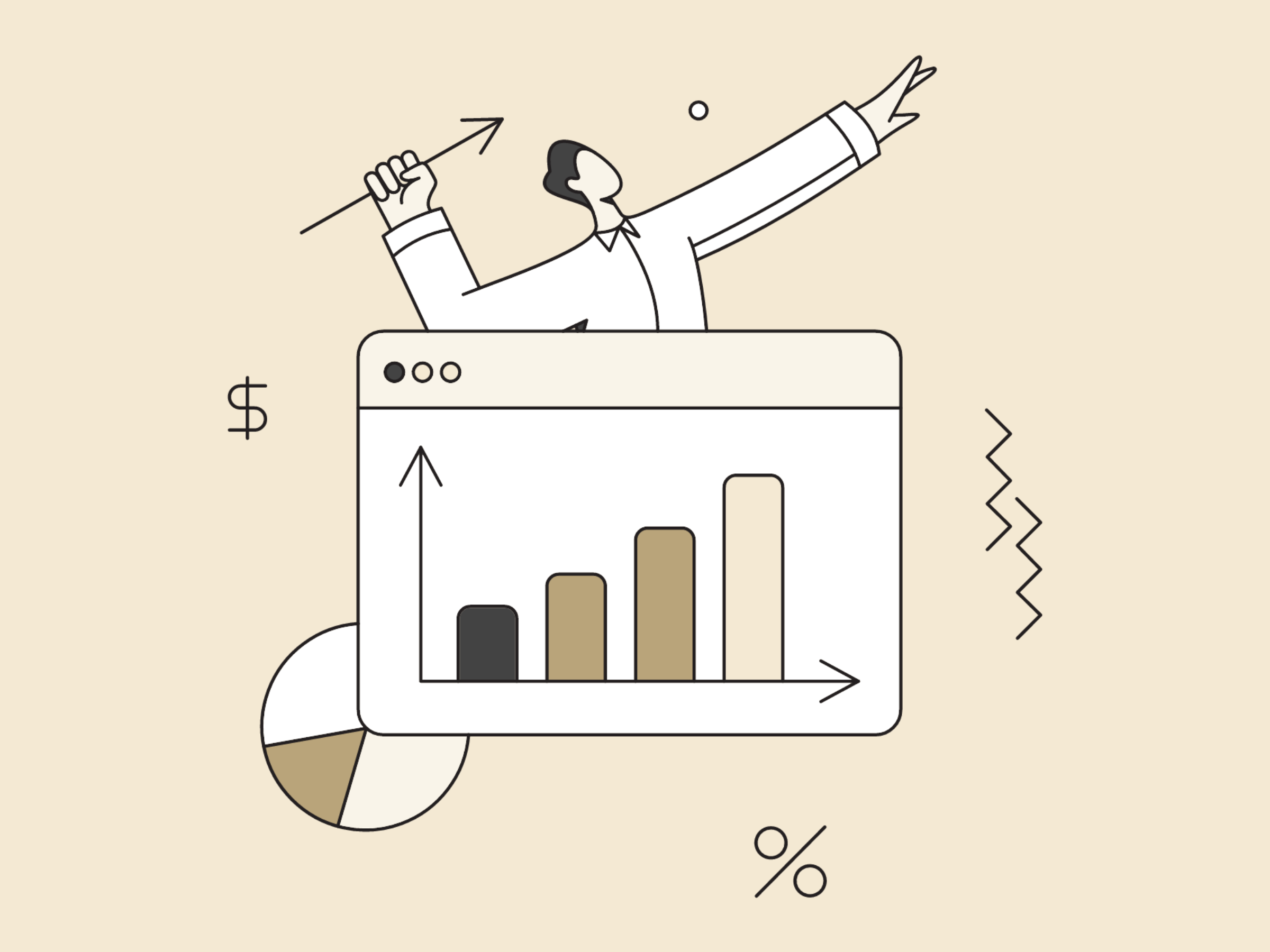
This new(ish) design method first showed up on my radar about five years ago while exploring the world of high-growth startups in East London’s Tech City. Growth design builds on problem-solving, focusing on people by using scientific methods to enhance business practices. It involves creating meaningful web experiences at scale so that a brand can exceed its business goals while delighting customers. Win-win.
If you have a clue your current store theme isn’t quite doing its job, now is the time to discover how fashion and beauty giants like ASOS and Sephora keep customers happy and coming back for more.
To simplify things, we’ve compiled the ultimate guide to redesigning your ecommerce website with growth design.
What’s wrong with traditional web design?
It might sound strange, but I love the look people give me when I ask them about the last time they redesigned their website. They all roll their eyes and sigh or groan with exasperation. If you hired a freelancer or went down the DIY route of launching your last website, you already know the process wasn’t as quick and painless as you thought.
The traditional approach to web redesign is a nerve-wracking experience for everyone involved. Web designers are frustrated by the endless rounds of revisions, and business owners are terrified of watching their marketing budget evaporate as the project drags on for months and goes over budget.
The old-school approach to web redesign needs a makeover. It’s expensive, time-consuming, and risky. From the enormous upfront costs to the subjective designs without any guarantees of success, the entire process is a recipe for disaster. As for the final result? That’s a stress-inducing nightmare that leaves business owners with websites they’re too scared to touch until they’re desperately outdated.
But why do we accept this? Because it’s the only way we know how to do it.
The misconception has spread that web redesign is a complex and daunting task requiring a huge team of experts and a hefty budget. But the truth is, it doesn’t have to be that way.
There’s a better way to redesign your ecommerce site that’s faster, cheaper, and less risky. And best of all – it puts you in control.
More on that later.

How can you tell that your store theme needs upgrading?
If your website is over two years old, it probably needs to be updated to keep it from costing you customers. You might not even notice it, but are five things to look out for:
Your website no longer looks on brand.
If you’ve expanded your brand offering to include a broader range of products, but your website still looks and sounds like the old you, it’s time for an update.
Consumers expect brands to have a consistent identity across all channels, and your website is no exception. A study by McKinsey & Company found that 70% of consumers are more likely to buy from a brand with a consistent identity across all channels.
When your website doesn’t reflect your brand identity, it can lead to many negative consequences, such as reduced brand loyalty, decreased sales, and increased customer churn.
For example, if your website still uses your old logo and messaging, but your brand has since evolved, it can send mixed signals to consumers and make it difficult for them to understand what you’re all about. Mixed messages can lead to confusion, frustration, and lost sales.
If you’re unsure whether your website needs an update, take a step back and look at it from a customer’s perspective. Does your website accurately reflect your brand identity? Is it visually appealing? Are you keeping up with competitors by adding features that create a powerful customer experience?
If you answered no to any of these questions, it’s time to refresh your Shopify website. A well-designed website will help you to communicate your brand identity to consumers, build trust, and drive sales.
It’s a mobile nightmare.
Mobile shopping is on the rise, with more and more consumers using their smartphones and tablets to purchase goods and services. A recent study by Statista found that mobile commerce sales are likely to reach $3.4 trillion worldwide by 2027.
Mobile shopping is surging, driven by its undeniable convenience and the rise of influential trends like high-speed mobile internet, popular payment apps, and ever-improving shopping experiences.
Consumers appreciate the convenience of shopping on the go, whether commuting, waiting in line, or relaxing at home. High-speed mobile internet makes it possible to browse and purchase products quickly and easily. Mobile payment apps make it even easier to check out, as consumers can simply enter their payment information once and then use it to purchase from multiple merchants. And finally, the improved user experience of mobile shopping websites and apps makes it more enjoyable and convenient for consumers to shop on their mobile devices.
A user-friendly mobile site is a must for any business. Convenience, speed and easy payments fuel mobile shopping’s meteoric rise – and it’s not slowing down anytime soon.
How do you know when a website isn’t mobile-friendly?
There are several telltale signs that a website isn’t mobile-friendly. Here are some of the most common indicators:
- Small text and images: The text and images on the website are too small to read or see clearly on a mobile device.
- Difficult navigation: The website’s navigation is difficult to use on a mobile device, with tiny buttons and links that are hard to tap.
- Slow loading times: The website takes a long time to load on a mobile device.
- Unresponsive elements: The website’s design isn’t responsive – meaning it doesn’t adapt to different screen sizes.
If your website displays any of these indicators, it’s time to upgrade. A mobile-friendly website will make it easier for your customers to shop with you on their mobile devices, leading to increased sales and improved brand loyalty.
It takes forever to load.
Site speed is one of the most critical factors impacting customer experience and sales conversions. A study by Google found that a one-second delay in page load time can result in a 7% reduction in conversions. Why? Because consumers are increasingly impatient and expect websites to load quickly. If a website takes too long to load, consumers will likely abandon it and shop elsewhere.
Site speed also impacts customer satisfaction. Numerous studies show that 40% of consumers will abandon a website if it takes more than three seconds to load. A slow website can lead to unhappy customers who are less likely to return or do business with you in the future.
However, site speed can also have a positive impact on sales conversions. Research shows a one-second improvement in page load time can increase conversions by up to 27%. So, every second counts.
Why do slow site speeds impact discoverability?
Site speed is also essential in search engine optimisation (SEO). Google and other search engines use site speed as one of the factors they consider when ranking websites in their search results. Therefore, a slow website is less likely to rank well in search results, making it more difficult for potential customers to find your website.
In addition, Google has a program called Accelerated Mobile Pages (AMP), which is designed to improve mobile web pages’ loading speed. Google caches AMP pages, causing them to load much faster than traditional mobile web pages. Google prioritises AMP pages in its search results, meaning they are more likely to rank higher than non-AMP pages.
It’s a black hole of traffic.
Your website’s bounce rate is the percentage of visitors who leave your website after viewing only one page. A high bounce rate can indicate something’s wrong with your website, such as slow loading times, poor navigation, or irrelevant content.
Here are some of the most common reasons for a high bounce rate:
- Slow loading times: Visitors are impatient and expect websites to load quickly. Visitors are more likely to leave if your website takes more than a few seconds to load.
- Poor navigation: Visitors should be able to quickly find the information they’re looking for on your website. If your website’s navigation is confusing or difficult to use, visitors are more likely to get frustrated and leave.
- Irrelevant content: Visitors should land on a relevant page to their search query. If they land on an irrelevant page that doesn’t contain the information they’re looking for, they’re more likely to leave.
- Lack of trust: Visitors are likelier to leave a website if they don’t trust the business. However, this can be due to several factors, such as a lack of customer reviews, a poor security reputation, or a lack of contact information.
How do you know if your site has issues with bounce rate?
You can use a web analytics tool like Google Analytics to track your website’s bounce rate and identify the pages with the highest bounce rates. To do this, go to Google Analytics and click the Behaviour tab. Then, click on Site Content > All Pages.
You’ll see a column for Bounce Rate on the All Pages report. This column shows the percentage of visitors who left your website after viewing only the page you’re viewing.
If you notice that any of your pages have a high bounce rate, you can investigate further to see why. For example, you can check to see if the page is loading slowly, if the navigation is confusing, or if the content is irrelevant.
It’s like navigating through a maze.
Your store’s navigation is like a roadmap. It helps visitors find their way around your website and get the information or products they seek. Visitors are more likely to leave if your navigation is confusing or difficult to use.
A common issue is having too many menu items in your header navigation. A cluttered navigation bar can be overwhelming and confusing for visitors. So, a quick fix is limiting your menu items to seven or fewer items with clear and concise labels and icons. It might sound obvious, but a clear and concise navigation bar lets customers know what to expect when they click on a menu item.
Additionally, a search bar can be a lifesaver for visitors who know what they’re looking for but can’t find it quickly through your navigation. If search functionality is missing from your main navigation, this can cause more visitors to bounce.
How do I keep my site from being a revolving door for customers?
Visitors are more likely to stay on a website that loads quickly, is visually appealing and easy to navigate. But how do you overhaul your online presence without breaking the bank or spending months in development?
Calling ‘Growth Design’ to the rescue!
What exactly is Growth Design?
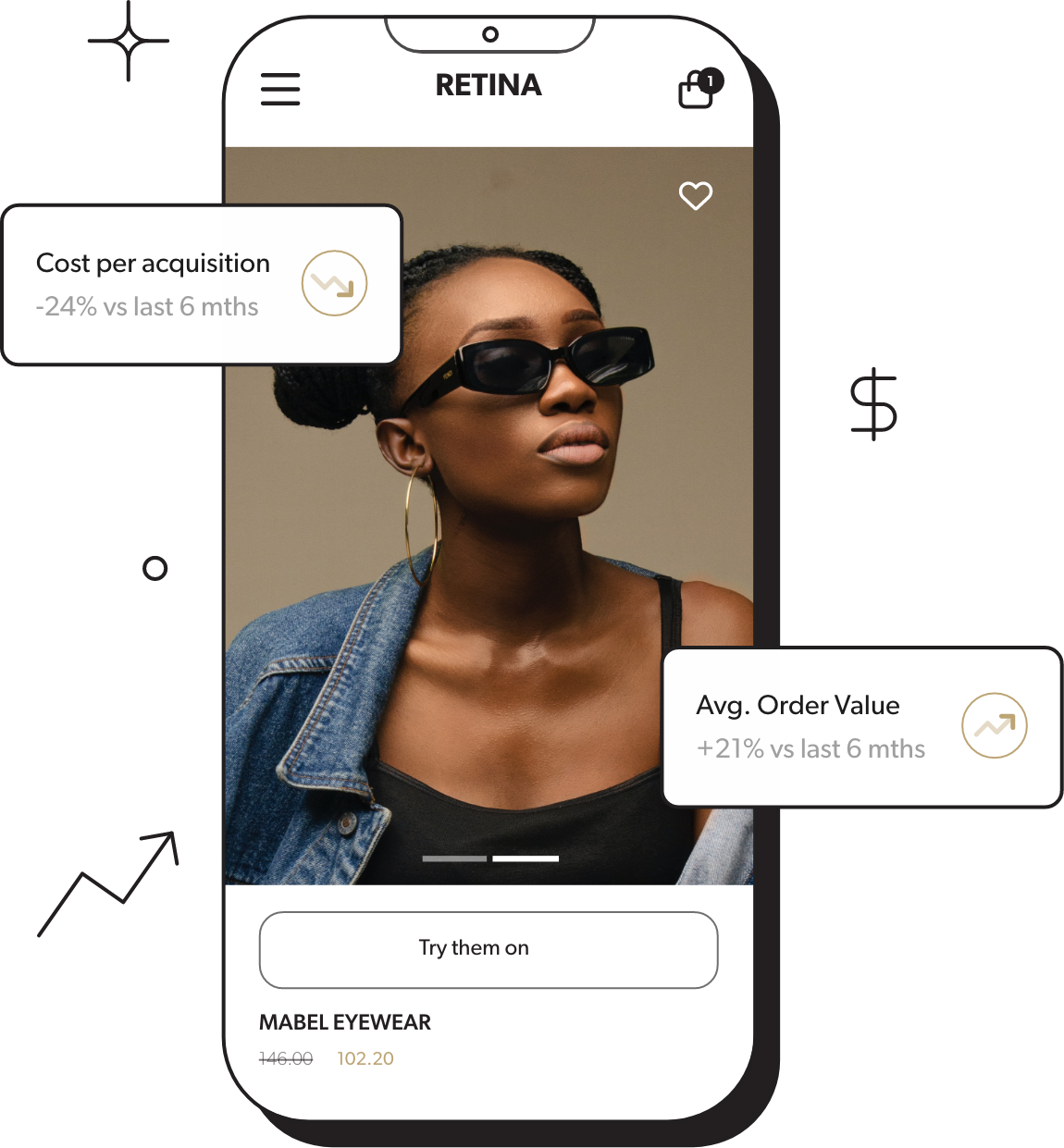
Gone are the days of spending months in development on the perfect website. Growth Design is an entirely different approach and way of thinking about scaling your online store. It’s focused on achieving specific goals, such as increasing conversions or improving customer engagement. And that means you’re more likely to see a positive impact on your bottom line.
Traditional website design focuses on creating a website that looks good and is easy to use. It’s a static process, where the website is designed once and then launched. After that, it may get the occasional update with new blog content, but it doesn’t evolve constantly with customers’ needs.
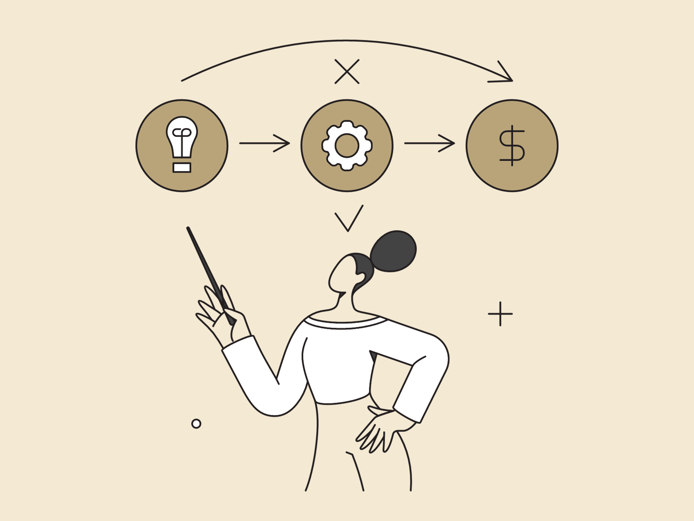
Growth design, on the other hand, is an iterative process that focuses on improving the customer experience and increasing conversions. It’s a data-driven approach where you’re constantly researching, testing and learning about your customers to inform store improvements. The research helps design and marketing teams to work together, experimenting with new features and messages to see what works best.
Because it’s an iterative process, you can make small changes and see how they perform before making more significant updates. That way, you reduce the risk of making changes that could hurt sales.
How do you approach the ecommerce redesign process with a growth mindset?
If you know it’s time to give your online store a makeover, start by analysing your store’s data to see where you can improve. You might find that your product pages aren’t converting well, or some features are difficult to use. Once you’ve identified the areas where you can improve, you can start making a plan.
Just like traditional website design, growth design starts with strategy. Developing a solid strategy to ensure your growth design efforts align with your business goals is essential.
A well-defined strategy will help you to identify your target audience, understand their needs, and develop a plan to achieve your desired outcomes. It will also enable you to prioritise your efforts and maximise your resources.
Here are some key questions to consider when developing your growth design strategy:
- Who is your target customer?
- What are their needs and pain points?
- What are your business goals?
- What key metrics will you use to measure success?
- What resources do you have available?
Once you have a good understanding of these factors, you can start to develop a plan for how you will achieve your goals. This plan should include specific objectives, timelines, and resources.
It’s important to note that growth design is an iterative process, so your strategy should be flexible enough to adapt as you learn and grow. A solid strategy will help you stay on track and achieve your objectives.
If your ecommerce site is slow, clunky, and driving customers away, it’s time for a growth design makeover.
Traditional web design is a one-and-done approach that doesn’t cut it for ecommerce businesses. Growth design is a data-driven, iterative approach that lets you experiment and learn from customer behaviour. You can constantly evolve your site with the latest trends and make it more profitable.
Here’s the bottom line: If you want to grow your ecommerce business, you need a website designed for growth. And that means growth design.
Want to learn more about how growth design can help you grow your ecommerce business? Get in touch with us today for a free consultation.
Don’t wait until it’s too late. Upgrade your website with growth design today and start seeing results.
