

When it comes to your digital presence, a mobile-friendly online store is your catwalk to the world. But could a few missteps be tripping up your style? With almost 60% of online shoppers using their phones last year, even minor mobile website signs you’re losing sales can have a major impact. That’s a huge chunk of your potential customers you might be missing out on if your online store isn’t mobile-friendly.
Let’s dive into the seven signs that suggest your mobile site might be due for a trendy makeover.
1. A Case of the Scrolls
Picture this: a shopper’s thumb, swiping left, right, left—just to see your latest collection.
That’s kind of what happens with content overflow on mobile websites. It occurs when there’s too much content crammed onto a single screen, forcing people to scroll horizontally.
Overflowing content might seem like a minor inconvenience, but it becomes a major frustration for shoppers on a small mobile device.
Here’s why content overflow is a problem:
- Limited Scrolling Space: Phones have limited screen real estate, and horizontal scrolling eats into precious space needed to view products and navigate your site.
- Accidental Touches: With everything crammed together, users are more likely to accidentally tap the wrong element while scrolling, leading to frustration and potentially abandoning their purchase.
- Disrupted User Experience: Imagine scrolling through product images and suddenly needing to jump sideways to see the full description. This disrupts the natural browsing flow and makes it harder for users to engage with your content.

Embrace Responsive Design
Think of responsive design as your website’s undies. Just like good shapewear adapts to different body types, responsive design ensures your website adjusts its layout and content to fit any screen size, including mobile devices. This eliminates the need for horizontal scrolling and creates a seamless browsing experience.
Image Optimisation is Key:
Large, unoptimised images are a major culprit behind content overflow. We’ll discuss this later, but don’t upload giant photos hoping for one-size-fits-all. Use editing tools to compress and resize them to appropriate dimensions for mobile viewing, and use larger versions for larger screens. This helps images load faster and reduces the strain on mobile data plans.
Think “Mobile-First” for Video Content:
Videos are engaging, but on mobile, they can quickly lead to content overflow. Sometimes, static product images with clear descriptions might be a better choice for mobile users, especially for showcasing details.
Prioritise Content Hierarchy:
Not all content is created equal. On mobile, prioritise the most critical information for shoppers. This might involve:
- Leading with product images and essential details (price, size, etc.)
- Hiding or collapsing longer descriptions that are accessible with a “read more” button.
- Utilising carousels or stacked layouts for product listings instead of side-by-side displays.
By implementing these tips, you ensure your content is displayed beautifully on mobile devices, creating a frustration-free browsing experience for your customers and ultimately boosting your sales.
2. Tiny Text = Tiny Sales: Why Readability Matters on Mobile
Have you ever squinted at a label, desperately trying to read the ingredients or washing instructions? That’s exactly what happens when mobile shoppers encounter microscopic text on your website. Here’s why it’s a major no-go for your ecommerce site:
Eye Strain and Frustration: Staring at tiny text on a small screen is a recipe for eye strain and frustration. Shoppers shouldn’t have to work that hard to learn about your products!
Missed Conversions: If customers can’t easily read product descriptions, size charts, or other vital details, they’re more likely to abandon their purchase altogether.
Diminished Brand Experience: Your brand story and product descriptions deserve the spotlight. Illegible text undermines your brand image and professionalism.
Your text needs to pop, be clear, and be legible so that your brand’s story and the juicy details of your products are as readable as your favourite glossy magazine.
Text that Pops: Mobile Readability Hacks
Let’s face it: nobody wants to fight with microscopic text on their phone. It’s time to ditch the squint-fest and make your website’s text as easy on the eyes as Anthony Bridgerton! Here are a few simple hacks:
- Font Size Matters: Think bigger is better! Ditch the tiny font and choose a size that lets your brand story and product descriptions shine without requiring detective-level zooming.
- Line Height Love: Line height isn’t just a fancy term—it’s the space between your text lines. Increase the line height for a more comfortable reading experience. Imagine it as adding breathing room to your text, making it less cramped and easier to follow.
- Embrace Bold and Italics: Using bold and italics can highlight essential information without overwhelming your readers. Think of them as your text’s little helpers, highlighting important details like product features or special offers.
- Say no to Text Walls: Large blocks of unbroken text can be intimidating on mobile. Break things up with shorter paragraphs, bullet points, and even emojis (used sparingly, of course!). Think of it as creating a visually appealing flow of information that’s easy to digest on the go.
Remember, mobile shoppers are often browsing on the fly. Give them a clear, concise, and easy-to-read text that lets them learn about your brand and products with minimal effort.
3. Tap, Tap…Nothing?
Ever tried to click a button on your phone only to tap so furiously that your finger feels like it’s doing flamenco? That’s the struggle of unresponsive elements on a website. Let’s break it down – Responsive elements are like a multi-way bra. Just like you can adjust the straps to suit any outfit, responsive elements adapt and change their size and layout to fit any screen, from desktops to teeny-tiny phone screens.
Here’s why responsive elements are a must-have for your mobile store:
Frustration-Free Navigation: Imagine menus that don’t fit the screen, forcing shoppers to scroll sideways just to find what they want. Not cool. Responsive elements ensure smooth and easy navigation on any device, keeping your customers happy.
Clicking Chaos: Unresponsive buttons are a recipe for disaster. Users shouldn’t have to play “hunt the clickable link” to add something to their cart. Responsive elements ensure everything is sized and positioned perfectly for a tap-happy mobile experience.
Aesthetics Matter: A website that looks amazing on a desktop but resembles a jumbled mess on mobile reflects poorly on your brand. Responsive elements guarantee a visually appealing and consistent look across all devices, leaving a lasting impression on your customers.
These issues scream “amateur hour” and frustrate potential customers. Don’t let your website be the reason they abandon their shopping cart!
Making Your Website Responsive
The good news? Making your website responsive is easier than mastering that winged eyeliner look (although both are totally worth it!). Here are some tips:
- Embrace Responsive Design: If you have an official Shopify theme, you’ve got this covered. This magic coding technique already woven into your ecommerce template’s fabric ensures your website automatically adjusts for different screen sizes.
- Test, Test, Test!: Don’t just assume it works – test your website on various devices (phones, tablets) to identify and fix any layout issues.
- Simplify Your Design: Clean and clutter-free layouts translate better to mobile. Ditch fancy website tricks that might not work on smaller screens.
A responsive website is an investment in your brand’s image and customer experience. By ensuring everything looks flawless and functions perfectly on mobile, you’ll create a frustration-free shopping haven for your clientele, leading to more sales and a thriving online store.
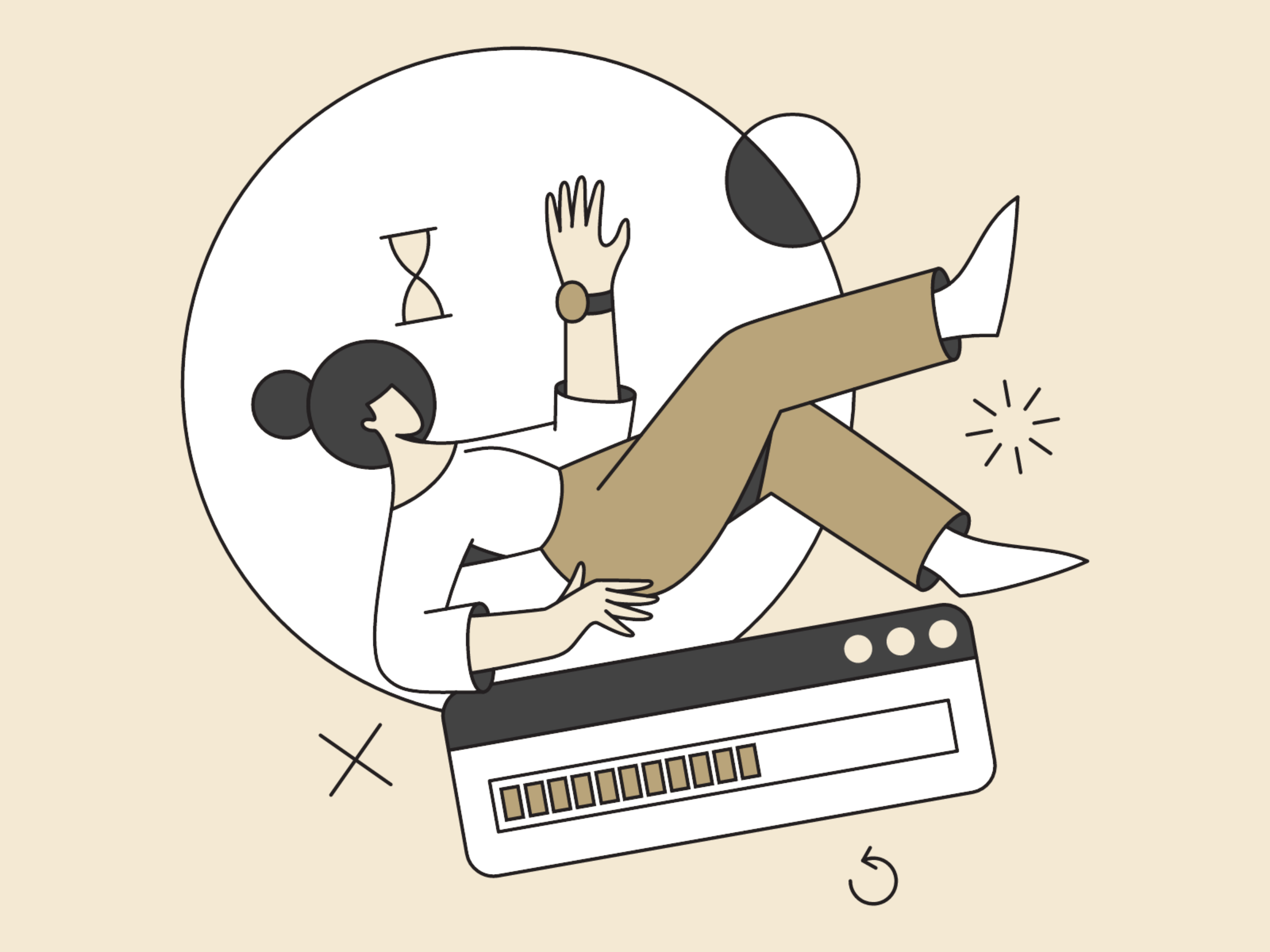
4. The Waiting Game: Why Slow Loading Speeds Kill Sales (and Your Vibe)
Who has time to wait when there’s fashion to be had? Imagine this: you’re on the hunt for the perfect pair of statement earrings, phone in hand, ready to swipe that “Buy Now” button. But then… nothing. The website grinds to a halt, the loading bar gets stuck, and your shopping excitement fizzles faster than cheap plonk.
Sound familiar? That’s the struggle of slow loading speeds. Here’s why it’s a major buzzkill for your mobile store:
Attention Spans are Short: We live in a world of instant gratification. Mobile shoppers are impatient – if a website takes too long to load, they’ll bounce faster than you can say “checkout.”
Frustration = Abandoned Carts: Nobody wants to wait around for a website to load, especially on a slow mobile connection. Slow speeds lead to frustrated shoppers who ditch their carts before completing their purchase.
Hurts Your Brand Image: A slow website screams “amateur” and reflects poorly on your brand. You want to be seen as a boss babe with a top-notch online store, not someone stuck in the dial-up era.
Tips for a Faster, Flawless Shopping Experience
There are ways to make your website a mobile speed demon:
- Image Optimization is Key: Resize and compress your images for faster loading without sacrificing quality.
- Say No to Autoplay Videos: Let users choose when they want to watch a video, and optimize the ones you do have.
- Simplify Your Design: A clean and clutter-free website is a fast website. Ditch unnecessary elements that might slow things down.
- Consider a Content Delivery Network (CDN): A CDN stores your website’s content on servers around the world, delivering it faster to your global audience.
A slow website is like a bad date – it leaves a negative lasting impression and ensures you won’t get a second chance. Implementing these tips allows you to transform your website from a tortoise to a hare – keeping your customers happy.
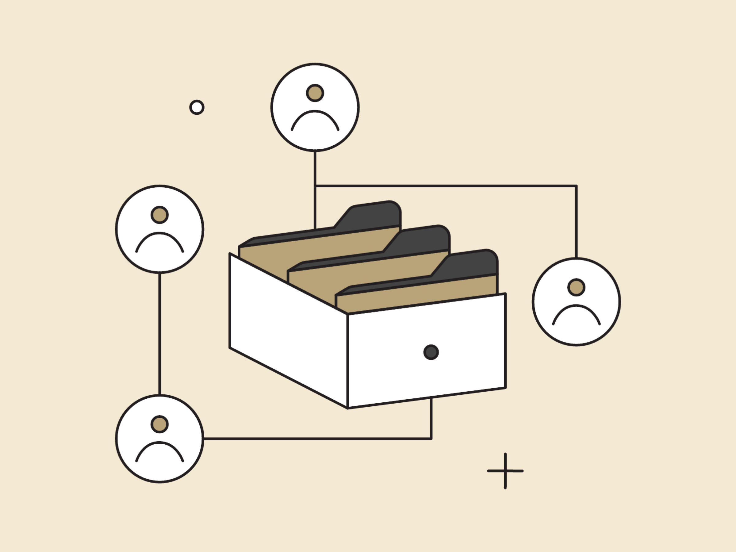
5. Menu Mayhem
Imagine strutting into your fave boutique, only to find the clothes racks jumbled up and the labels switched around. That’s kind of what happens when your mobile website has inconsistent navigation and menus. It leaves shoppers confused, frustrated, and definitely not in the mood to buy anything. Here’s why consistent navigation is a must-have for your mobile store:
Lost and Frustrated Shoppers: Inconsistent menus with hidden options or layouts that change from page to page leave users feeling lost and frustrated. Nobody wants to play hide-and-seek with your products!
Missed Sales Opportunities: If shoppers can’t easily find what they’re looking for, they’ll abandon ship and head to a competitor with a more user-friendly experience.
Boss Up Your Navigation: Tips for a User-Friendly Mobile Experience
Creating a user-friendly navigation system is easier than mastering that perfect smoky eye look (although both are totally worth it!). Here are some tips:
- Keep it Simple and Consistent: Use a clear and consistent menu layout across all your mobile pages.
- Label with Clarity: Use easy-to-understand labels for each menu item. Think of it like clear signage in your boutique – where everything is should be obvious.
- Easy Access: Make sure your main navigation menu is easily accessible from every page on your mobile website.
- Prioritise Key Pages: Highlight your most important pages (like “Shop,” “About Us,” and “Contact”) in your navigation menu.
Consistency is the hallmark of great style—and great user interfaces. Your mobile navigation should be as intuitive as your desktop’s, guiding your clientele from wish list to checkout with finesse. Implementing these tips can transform your website’s navigation from a confusing maze to a user-friendly map.
6. Picture-Perfect Please
Imagine you’ve got the perfect ensemble pictured on your website, ready to slay the ‘gram and sell out your inventory. But then, disaster strikes! The image loads like a sloth on vacation, blurry and pixelated. Yikes! That’s the struggle with unoptimised images and videos on mobile. Here’s why they’re a total buzzkill for your online store:
Slow Loading = Slow Sales: Large, unoptimised images and videos are a major culprit behind slow loading times. Remember, mobile shoppers are impatient – a website that takes forever to load is a website they’ll abandon.
Bye-bye, Clarity: Blurry, pixelated images make it impossible for shoppers to see the details of your products. How can they fall in love with something they can’t see clearly?
Data Drain Drama: Large unoptimised media files gobble up mobile data, which can be a major concern for users on limited plans. Don’t make them choose between browsing your site and having enough data for the rest of the month.
Your website’s visuals are like the window display of your online boutique. Blurry windows and outdated mannequins won’t attract customers.
Tips for Mobile-Friendly Images & Videos
Getting your images and videos mobile-ready is like applying the perfect filter – it enhances everything! Here are some tips:
- Compress Those Pixels: There are many ways to compress your images without sacrificing quality, keeping file sizes smaller and loading times faster.
- Choose the Right Format: Use JPGs for photos and PNGs for graphics with transparent backgrounds. Knowing the right format helps optimise file size.
- Consider Resizing: Don’t upload giant photos! Resize your images to appropriate dimensions specifically for mobile viewing.
- Think About Video Options: High-quality photos might be more mobile-friendly than autoplay videos for some products.
- Optimise for Different Screen Sizes: If you must use video, consider offering multiple resolutions optimised for different screen sizes and data connections.
Visuals are your brand’s voice in colour and light. Ensure they speak volumes by optimising for mobile so they load pronto and look fabulous, even on the tiniest screens.
By implementing these tips, you can transform your website’s media from a blurry mess to a crystal-clear showcase of your amazing products. Faster loading times, sharp images that let your products shine, and a frustration-free browsing experience will lead to happy and converted shoppers – #Winning!
7. Missing Mobile Magic
Imagine trying to paint delicate nail art with a toothbrush. That’s kind of the struggle mobile customers face with online stores that lack mobile-specific features. A website designed for desktops just doesn’t cut it on a phone.
Here’s why catering to mobile shoppers is crucial for your online store:
Frustration at Checkout: Complicated checkout processes with tiny forms and endless clicks are a nightmare on mobile. One-click checkout options and mobile payment integration are essential for a smooth and speedy checkout experience.
Pinch-and-Zoom Frenzy: Nobody wants to play “hunt the clickable element” on their phone. Mobile-specific features like larger buttons, clear product options, and easy-to-navigate menus are essential for a frustration-free shopping experience.
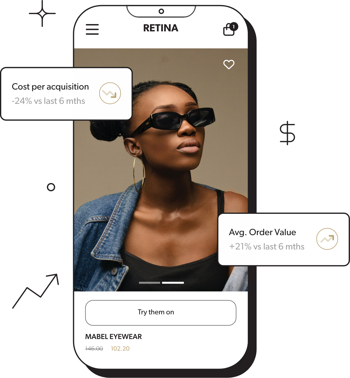
Missing Out on Sales: If your website isn’t mobile-friendly, you’re basically shutting the door on almost 60% of potential customers. Mobile shopping is booming, and you don’t want to get left behind!
Tips for Happy Shoppers & Booming Sales
Giving your mobile shoppers the features they deserve is like offering them a complimentary glass of bubbly – it elevates the entire experience! Here are some tips to get you started:
- Streamline the Cart: On mobile, consolidate your shopping cart into a single, scrollable page. This gives users a clear overview of their selections and makes it easy to edit quantities or remove items.
- Guest Checkout: Offer a guest checkout option alongside account creation for a faster checkout experience.
- Autofill Magic: Pre-fill shipping and billing information whenever possible, especially for returning customers. This saves them time and reduces the risk of typos.
- Think “Tappable,” Not “Clickable”: Use larger buttons with clear labels and ensure everything is spaced out for easy tapping on a mobile screen.
Mobile shopping isn’t just about scaling down—it’s about levelling up. Introduce mobile-specific features that turn every browse into an experience, from easy-peasy forms to one-tap checkouts.
Go From Sales Slump to Shopping Spree
Transforming your online store into a mobile-friendly haven isn’t just about sidestepping these snags; it’s about crafting an experience that’s as compelling and stylish as the audience you dress. Take a moment to assess your online store, and if you’re looking to elevate your mobile game, remember—Impulsiv is here to stitch together a mobile presence as dazzling as your brand.
Thinking of a mobile revamp? Let’s chat, and together, we’ll design a mobile boutique that’s the envy of the ecommerce world!
Lead the style pack with Impulsiv. Keep up with us on Facebook, Instagram, LinkedIn, and Twitter for more insights and trends.


